Output Formats
Add @format to any method to control how its return value is displayed. Without it, Photon renders JSON. With it, you get tables, charts, diagrams, dashboards, and more.
Every format works on all three surfaces — Beam renders rich HTML, the CLI renders ASCII/text, and MCP returns structured data with format hints for the client.
Tables
@format table
The default for arrays of objects. Sortable columns, paginated rows, and expandable row details (click any row to see all fields).
/** @format table */
users() {
  return [
    { name: "Alice", email: "alice@co.com", role: "admin", joined: "2025-01-15" },
    { name: "Bob", email: "bob@co.com", role: "user", joined: "2025-03-20" },
  ];
}
Auto-detected cell rendering: dates are formatted, URLs become links, status fields get colored badges.
Column Format Pipes
Apply per-column formatting with the @columnFormats hint:
/** @format table {@columnFormats revenue:currency,margin:percent,name:truncate(20)} */
sales() {
  return [
    { name: "Enterprise North America", revenue: 142830, margin: 0.234 },
    { name: "Mid-Market Europe", revenue: 98450, margin: 0.182 },
  ];
}| Pipe | Effect | Example |
|---|---|---|
currency | Locale currency (default USD) | $142,830.00 |
percent | Percentage (values 0-1 are auto-scaled) | 23.4% |
date | Locale date format | Jan 15, 2025 |
truncate(N) | Cut to N characters with ellipsis | Enterprise Nor... |
number | Locale number grouping | 142,830 |
compact | K/M/B abbreviation | 142.8K |
Lists
@format list
Styled list with title, subtitle, icon, and badge fields.
/** @format list {@title name, @subtitle email, @badge role, @icon avatar} */
team() { return this.members; }| Hint | Description |
|---|---|
@title | Primary text field |
@subtitle | Secondary text |
@icon | Leading image/avatar |
@badge | Status badge |
@style | plain, grouped, inset, inset-grouped |
Cards and Key-Value
@format card
Single object rendered as a styled card.
@format kv
Key-value pairs layout — good for settings, metadata, or single-record display.
@format grid
Array rendered as a visual grid. Use {@columns 3} to control column count.
@format chips
Array rendered as inline chip/tag elements.
@format tree
Hierarchical/nested data rendered as an expandable tree.
Charts
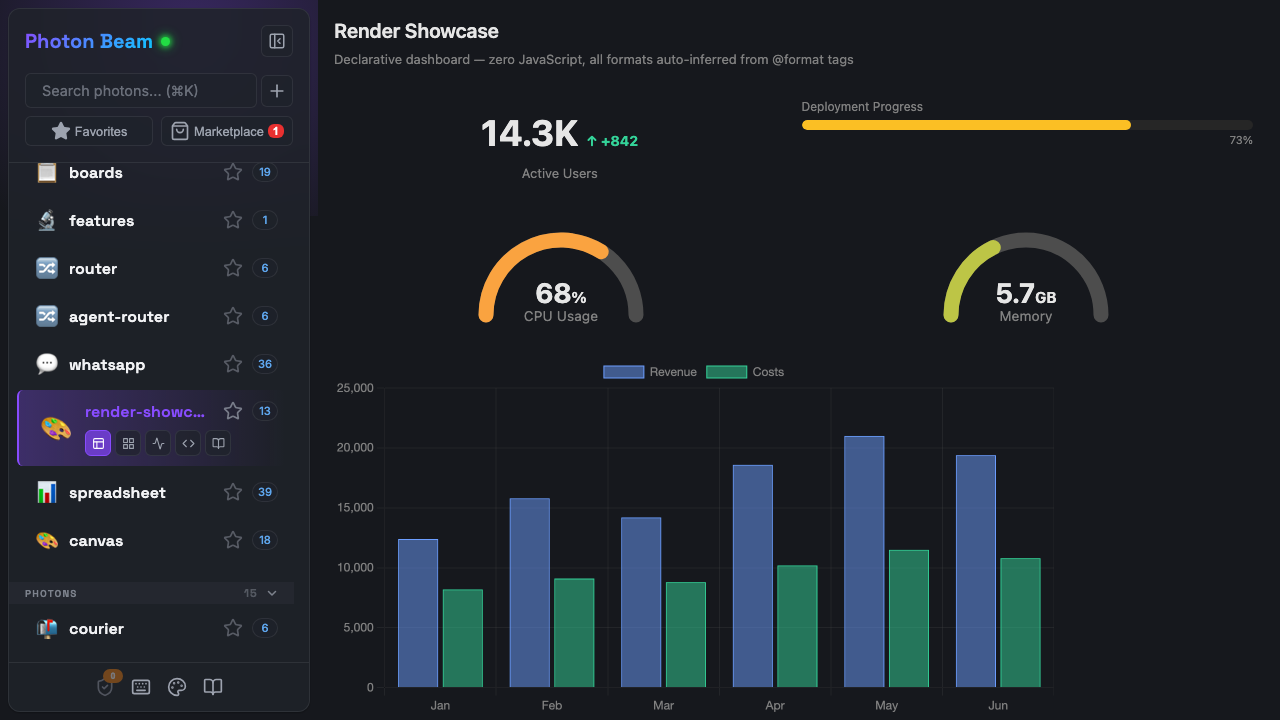
All chart types use Chart.js. Photon auto-detects the best chart type from your data shape, or you can specify explicitly.
@format chart:bar
/** @format chart:bar {@label region, @value revenue} */
revenueByRegion() {
  return [
    { region: "Americas", revenue: 45000 },
    { region: "Europe", revenue: 38000 },
    { region: "Asia", revenue: 52000 },
  ];
}
@format chart:line
Auto-detected for time series data (fields named date, timestamp, createdAt, etc.).
/** @format chart:line */
signups() {
  return [
    { date: "2025-01-01", count: 120 },
    { date: "2025-02-01", count: 185 },
    { date: "2025-03-01", count: 240 },
  ];
}
@format chart:pie
Auto-detected for 2-field arrays (one label + one number) with 8 or fewer items.
@format chart:scatter
XY scatter plot. Auto-detected when data has 2+ numeric fields and no string fields.
/** @format chart:scatter {@x height, @y weight} */
measurements() {
  return [
    { height: 170, weight: 68 },
    { height: 185, weight: 82 },
    { height: 162, weight: 55 },
  ];
}
@format chart:radar
Radar/spider chart for multi-dimensional comparison. Auto-detected for single items with 5+ numeric fields, or few items with many numeric dimensions.
/** @format chart:radar */
skills() {
  return [{ name: "Alice", coding: 9, design: 6, leadership: 7, communication: 8, testing: 8 }];
}
@format chart:histogram
Bins numeric values into a frequency distribution bar chart. Explicit only — not auto-detected.
/** @format chart:histogram {@x responseTime} */
latencyDistribution() {
  return this.requests.map(r => ({ responseTime: r.ms }));
}
Other chart types
chart:area (line with fill), chart:donut (doughnut), chart:hbar (horizontal bar).
Chart Hints
| Hint | Description |
|---|---|
@label | Category/x-axis field |
@value | Y-axis/size field |
@x | Explicit x-axis field |
@y | Explicit y-axis field |
@series | Field to group into multiple datasets |
Auto-Detection Rules
| Data shape | Detected type |
|---|---|
| Date field + numeric field | line |
| 2+ numeric fields, no strings | scatter |
| 2 fields (1 string + 1 number), ≤8 items | pie |
| 1 item with 5+ numeric fields | radar |
| ≤5 items with 4+ numeric + 1 string | radar |
| Everything else | bar |
Single Values
@format metric
Big number display with optional label, delta, and trend arrow.
/** @format metric */
revenue() {
  return { value: 142830, label: "Revenue", delta: "+12%", trend: "up" };
}
Data shape: { value, label?, delta?, trend? } — trend is "up", "down", or "neutral". A raw number also works.
@format gauge
Semicircular gauge with color gradient (green → yellow → red).
/** @format gauge {@min 0, @max 100} */
cpuUsage() {
  return { value: 73, label: "CPU" };
}
@format ring
Full-circle progress ring with center value text.
/** @format ring */
uploadProgress() {
  return { value: 73, max: 100, label: "Upload" };
}
Data shape: a number (0-100), { value, max?, label? }, or { progress } (0-1 normalized).
Text and Diagrams
@format markdown
Renders markdown with full formatting support.
@format mermaid
Renders Mermaid diagrams from a string. Supports flowcharts, sequence diagrams, Gantt charts, and more.
/** @format mermaid */
architecture() {
  return `graph LR
    A[Client] --> B[Photon]
    B --> C[CLI]
    B --> D[Beam]
    B --> E[MCP]`;
}
@format code / @format code:python
Syntax-highlighted code block. Append a language name for specific highlighting.
@format slides
Marp-style slide presentation. Separate slides with ---. Supports layouts, transitions, and embedded photon output.
Dashboards and Containers
@format dashboard
Returns an object where each key becomes a panel. Photon auto-detects the best renderer for each value (numbers → metrics, arrays → tables, etc.).
/** @format dashboard */
overview() {
  return {
    revenue: { value: 142830, delta: "+12%" },
    users: [{ name: "Alice", role: "admin" }, { name: "Bob", role: "user" }],
    uptime: { progress: 0.997 },
  };
}
Container Formats
Wrap multiple sections with layout control:
| Format | Description |
|---|---|
panels | CSS grid of titled panels |
tabs | Tab bar switching between sections |
accordion | Collapsible sections |
stack | Vertical stack with spacing |
columns | Side-by-side columns (2-4) |
Data is an object — keys become section titles/tab labels, values are rendered using auto-detected formats.
Specialty Formats
| Format | Description | Data Shape |
|---|---|---|
qr | QR code | URL string or { url } |
timeline | Vertical event timeline | [{ date, title, description? }] |
cart | Shopping cart with totals | { items: [{ name, price, quantity }] } |
checklist | Interactive checklist | [{ text, done }] |
Layout Hints Reference
Hints are specified in curly braces after the format name:
/** @format chart:bar {@label category, @value amount} */
/** @format list {@title name, @subtitle email, @style inset} */
/** @format table {@columnFormats price:currency,rate:percent} */
/** @format gauge {@min 0, @max 200} */| Hint | Used by | Description |
|---|---|---|
@title | list, gauge, ring, timeline | Primary text field or label |
@subtitle | list | Secondary text field |
@icon | list | Leading image field |
@badge | list | Status badge field |
@style | list | Layout style variant |
@columns | grid | Number of columns |
@label | chart | Category/x-axis field |
@value | chart | Y-axis/size field |
@x | chart, histogram | X-axis or binning field |
@y | chart | Y-axis field |
@series | chart | Multi-dataset grouping field |
@min | gauge | Minimum value (default: 0) |
@max | gauge, ring | Maximum value (default: 100) |
@date | timeline | Date field name |
@description | timeline | Description field name |
@columnFormats | table | Per-column format pipes |
@inner | containers | Force inner renderer type |
@filter | table, list | Enable client-side filtering |
Declarative UI (A2UI v0.9)
@format a2ui
Emits an A2UI v0.9 JSONL message stream derived from the return value. A2UI is Google's framework-agnostic declarative UI protocol; it rides on top of AG-UI, which Photon already speaks, so any AG-UI consumer that understands A2UI can render Photon output with no custom integration.
/** @format a2ui */
async list() {
  return [
    { name: 'Alice', role: 'Eng' },
    { name: 'Bob', role: 'PM' },
  ];
}
Auto-mapping (v1, Basic catalog only):
| Return shape | A2UI layout |
|---|---|
| Array of objects | List with a Card template row |
| Single object | Column of Text rows (one per key) |
{ title, description, actions: [...] } | Card with action buttons |
| Primitive | Single Text component |
Escape hatch. For full control, return the verbatim shape:
/** @format a2ui */
async surface() {
  return {
    __a2ui: true,
    components: [
      { id: 'root', component: 'Card', child: 'header' },
      { id: 'header', component: 'Text', text: 'Custom', variant: 'h1' },
    ],
    data: {},
  };
}
How it ships across transports:
- CLI: prints the JSONL sequence (one message per line).
- MCP / AG-UI: each A2UI message is broadcast as an AG-UI
CUSTOMevent nameda2ui.message. A consumer reassembles the JSONL stream. This is the primary integration path — paste the captured stream into A2UI Theater to see it render. - Beam: native renderer that walks the component tree, binds JSON Pointer values, and dispatches button actions back to the photon (see "Action round-trip" below).
Action round-trip — button name === method name
When a Beam user clicks an A2UI Button, the renderer dispatches an a2ui:action event and the Beam result-viewer routes it to the same photon by calling the method whose name matches action.event.name. No new contract — write a method, name a button after it, the click hits it.
/**
 * Stateful counter — view() returns the surface; increment() and reset()
 * are the action handlers. Each one returns the same surface shape, so
 * Beam re-renders in place after the click.
 *
 * @stateful
 */
export default class Counter {
  /** @format a2ui */
  async view() { return this.surface(await this.read()); }

  /** @format a2ui */
  async increment() {
    const next = (await this.read()) + 1;
    await this.memory.set('value', next);
    return this.surface(next);
  }

  /** @format a2ui */
  async reset() {
    await this.memory.set('value', 0);
    return this.surface(0);
  }

  private surface(value: number) {
    return {
      __a2ui: true,
      components: [
        { id: 'root', component: 'Card', child: 'col' },
        { id: 'col', component: 'Column', children: ['v', 'inc', 'reset'] },
        { id: 'v', component: 'Text', variant: 'h1',
          text: { call: 'formatString', args: { value: 'Value: ${/value}' } } },
        { id: 'inc', component: 'Button', text: 'Increment',
          action: { event: { name: 'increment' } } },
        { id: 'reset', component: 'Button', text: 'Reset',
          action: { event: { name: 'reset' } } },
      ],
      data: { value },
    };
  }
}
Action context: any TextField a user has edited gets captured into a local data-model snapshot and shipped as the call's arguments, so a Button { event: { name: 'submit' } } clicked next to TextField { value: { path: '/email' } } calls photon.submit({ email: '...' }).
Non-goals: stateful surface lifecycle across turns (each call replaces the surface), custom catalogs, two-way binding for non-TextField inputs.
For the complete tag reference including non-format tags (caching, validation, middleware, MCP annotations), see Tag Reference.